

Overview
Duration:
In Progress
Role:
Lead UX Designer
Responsibilities:
As the Lead UX Designer on this project, I applied the full UX design process taught in the Google UX Design Professional Certificate implementing industry-standard human-centered design methods and frameworks to identify real user problems and uncover user needs.
Description:
Supper Master is a faith-based meal and grocery planning app designed to bring families and friends back to the table – inspired by the story if Jesus feeding the multitude in Matthew 14:17-21.
In a time when shared meals are increasingly replaced by convenience and isolation, SupperMaster transforms meal planning from a stressful chore into a meaningful practice—helping households reduce waste, save money, and reconnect through intentional, shared meals.
Note: As this project continues to evolve, this case study will be updated with new discoveries, design iterations, usability testing outcomes, and reflections. Please revisit this page to see the latest progress.
1
Brand Identity Design
Color Palette
Primary Palette
The primary brand colors was selected to convey quality, warmth and a sense of family while maintaining a trendy, approachable feel through the addition of sage green. My goal was to ensure that these primary colors establishes the visual identity, personality, and recognition of the Supper Master brand.
Secondary Palette
The secondary brand colors complement the primary brand colors while providing visual consistency. I wanted to provide designers with additional flexibility when making decisions regarding hierarchy, emphasis, contrast and accessibility.
The color pairings below meet ADA and WCAG color contrast requirements for accessible interactive UI components.
Color Contrast Ratio Pairings
Ideal for interactive UI components essential graphics, text and text on Buttons (4.5:1 Ratio Minimum). Note: Pairing orange and green colors together should be avoided due to WCAG contrast requirements.

Color Contrast Ratio Pairings
Ideal for interactive UI components and essential graphics (3:1 Ratio Minimum)

Color Pairing Examples
Ideal for decorative UI elements and graphics (1.4:3 Ratio Minimum)

Signature Hues
These colors are the core visual identifiers and should be applied consistently across all branded materials.

Primary Palette Tints
The tints are available at 20%, 55%, 80%, and 95% lighter than the base color.

Black and White
Ideal for text and print applications where color where color options are limited.

Brand Typography
Paragraph Typeface
The Greycliff CF Regular typeface is a geometric sans-serif typeface selected for it's accessible and smooth readability. It provides a friendly tone for body text designed with clean, straight lines and circles, complementary to the Supper Master logo. Its modern, structured look remains clear and legible at small sizes across both print and digital applications.
Headline Typeface
The font pairing selected to use for headings alongside the Greycliff typeface is the Josefin Sans Bold typeface. This typeface is also sans-serif with a similar clean and minimalist geometric look. The typeface is characterized by its distinctive vintage Art Deco character which gives it a sophisticated and elegant look.

Logo Design and Development
Early Explorations

Once the color palette was defined, I began developing the logo through a series of sketches. Initially, I explored literal interpretations of the "Supper Master" name, sketching imagery such as forks, chef's hats and figure-ground concepts.
These early ideas helped me get my creative ideas flowing, however I quickly learned that a literal interpretation of the brand name did not convey Supper Master's core mission.
Concept Development
After further reflection, I begin focusing on the faith based aspect of the brand and it's mission of bringing people together through a shared meal. Referring back to the story of Jesus feeding the multitude in Matthew 14:17–21, I began sketching yin-yang inspired imagery that incorporated two fish and five loaves of bread.
I continued refining this concept, ultimately developing it into the final Supper Master logo.


Digital Vector Refinement
Once I established a design direction, I refined the logo using a standard grid system. My goal was to achieve precise, clean geometry, so I aligned the initial sketch to the grid and recreated it as a vector logo using primarily circles.

Final Composition
As the logo evolved, the foundational circular forms were carefully rotated by approximately -81.58° and trimmed to achieve the final composition.
This process transformed a collection of simple circular shapes into a distinctive logo.
The final design is balanced and proportioned, retaining the consistency and visual harmony resulting in a unique and recognizable identity.

Final Primary Logo Composition
The final logo design features a fish with a fin that transitions into the shape of a grain of wheat, symbolizing the bread and reinforcing the brand’s connection to its faith-based inspiration.
Full-color
Primary, Vertical, and Watermark Logo Clear Space

Full-color Inverted
The full-color Inverted logo brand is to be used on dark backgrounds or low color applications.
To minimize eye strain and halation, a charcoal grey is used for the background color. Greycliff CF Demi-bold typeface was selected for the tagline text rather than the bold weight used in the logo on standard white background, as lighter text on dark backgrounds can appear visually heavier.

Primary Logo Variations
Monochrome Application
The monochrome logo is designed using a single color from the approved brand color palette, incorporating variations of that color through different tones, shades, and tints.
Black and white may also be used as monochromatic treatments to create a clean, versatile, and cohesive visual identity.
This approach allows the logo to maintain its visual integrity and brand recognition across a variety of applications, backgrounds, and production formats.


Vertical Stacked Logo Variations
The vertical stacked logo variations are designed for small square or vertical spaces where the wide, horizontal logo may not fit properly or where the primary logo would need to be scaled down to a point that compromises legibility.
This version provides a more compact and balanced alternative while maintaining brand recognition. The stacked logo is best for business cards, small square product tags, stickers, social media applications and mobile interfaces where space is limited.
Full-color Vertical

Full-color Inverse

Solid-fill Vertical

Solid-fill Inverse

Outline Vertical

Outline Inverse

Horizontal Logo Variations
Full-color
The horizontal full-color logo variations are ideal for applications such as website headers, formal business documents, letter heads and invoices, storefront signage, banners and displays.


Monochrome
The horizontal monochrome logo variations are ideal for social media platforms, email signatures, specialty prints such as single-color embroidery, screen printing, or embossing and signage.


Watermark Logo Variations
The watermark variations serve as subtle extensions of the brand and demonstrate the logo’s strength, versatility, and ability to remain recognizable across different applications. The goal is to create a distinctive visual identity that is instantly recognizable, whether presented in full color or in black and white.
The watermark logo is ideal for profile images, thumbnails, print, packaging, photography, avatars, social media, and other digital applications where a more subtle brand presence is appropriate.
Full-color Watermark

Full-color Inverse

Solid-fill Watermark

Solid-fill Inverse

Outline Watermark

Outline Inverse

Logo Clear Space
To preserve the integrity, legibility, and visual impact of the Supper Master logo, a minimum area of clear space must be maintained around all sides of the logo. No text, imagery, graphics, or other visual elements should enter this protected area. Consistent clear space ensures the logo remains prominent and recognizable across all brand applications.
Primary, Vertical, and Watermark Logo Clear Space
The minimum clear space requirement for the primary, vertical stacked, and watermark logo variations is measured by the diameter of the circles positioned at the four corners of an imaginary bounding box surrounding the logo.


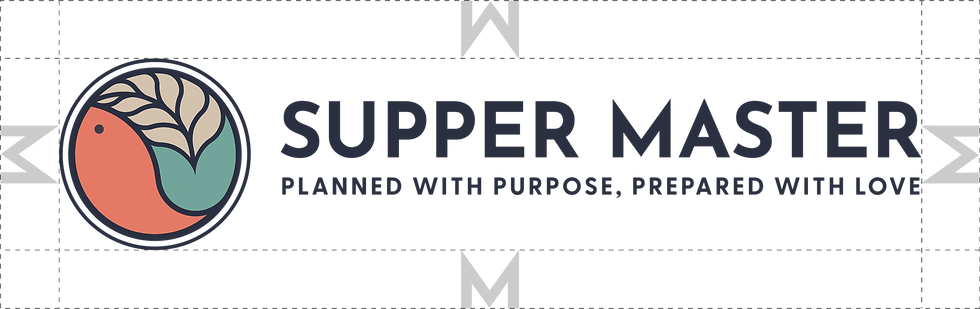
Horizontal Logo Clear Space
For the horizontal logo variation, the height of the “M” establishes the minimum clear-space requirement.
Examples of Digital Applications and Promotional Items


